
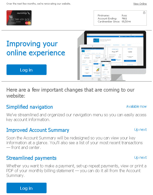
Oh look, Barclay is “improving your online experience!”
If it’s anything like the dozens of other website revamps I’ve seen in the past 2 years, here’s what “improvements” they’ll be making:
- Lots of new empty spaces
- Large, custom fonts
- Loss of visual distinction between interactive and non-interactive elements
- Much more scrolling required
- Resource-heavy animations
- Huge empty padding around important text
Sorry, this critique relates more to web design than credit cards, but I’ve seen a lot of good account management websites of various types (banking, credit cards, student loans, utility bills) go this route recently. I just couldn’t help myself; I had to rant :p
When I use the internet on my desktop computer I want a website; not a smartphone app. My computer’s web browser is not a cell phone. Stop treating it like one.